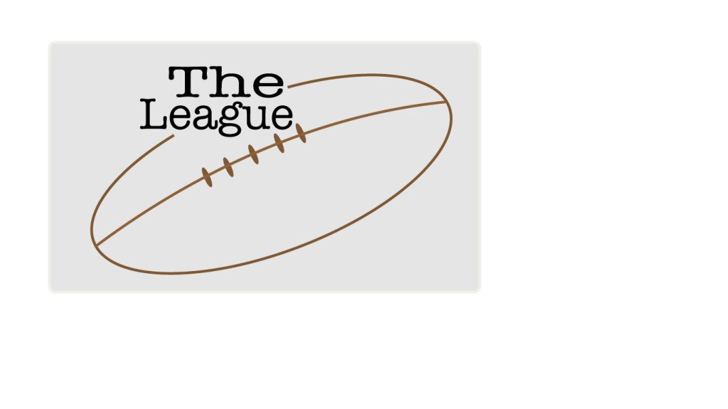
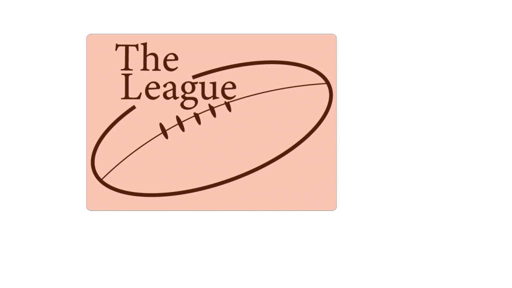
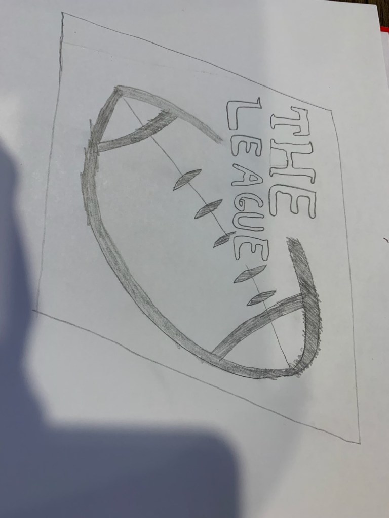
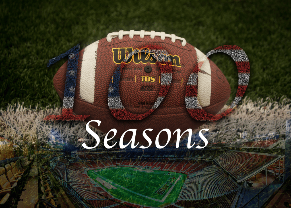
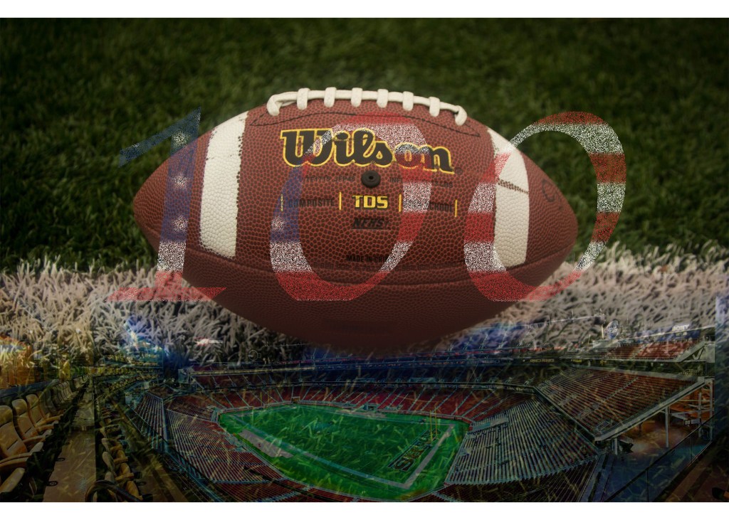
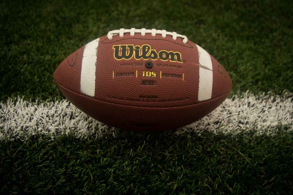
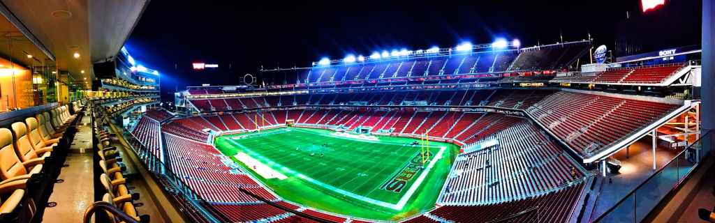
I decided to stick with my original image for my final illustrator project logo. This design was one that I felt had a strong embodiment of what I wanted to create. I listened to my groupmates words of advice and tried to make the edges of the football sharper to no avail. The pen tool would not allow me to create a point already on the path and adjust it so that it was scalable to the entire shape. I then tried the point tool and it continued to distort the entire footballs shape and did not allow me to create the exact shape I wanted. In the end I settled on this shape and decided to stick with it. I did head their advice by changing the color of not only the football but the backdrop. I felt as though the light red backdrop did not help the image at all and the red and black really had little to do with the entity I was creating. I went with a gray background and made the opacity just above 10%, this gave it a noticeable detail but did not take away from the rest of my image. I then decided to instead make the football brown like a large majority of actual footballs as the black outline did not do much for my football image in general. The final piece of advice I listened to was that of the grips. I decided that moving the words over and allowing the lacing to stay whole looked much better and by erasing some of the parts to fit the words over them did not help the image overall. I also went through and made the center lines stroke equal to that of the outer lines. Overall they were very minor changes but I definitely think that they helped my image in the long run to look better and more professional.